For the Lamb Weston brand, I used figma to compile all of the core brand and UI elements and created a Design System for the web pages.
• Design System creation
• Design System Web Standard Documentation
Responsible For:
• Creative Direction: David M
• Designer: Sabrina Newsome
Team Contributor:
A peak into the Design System Structure
LW Design System Core element
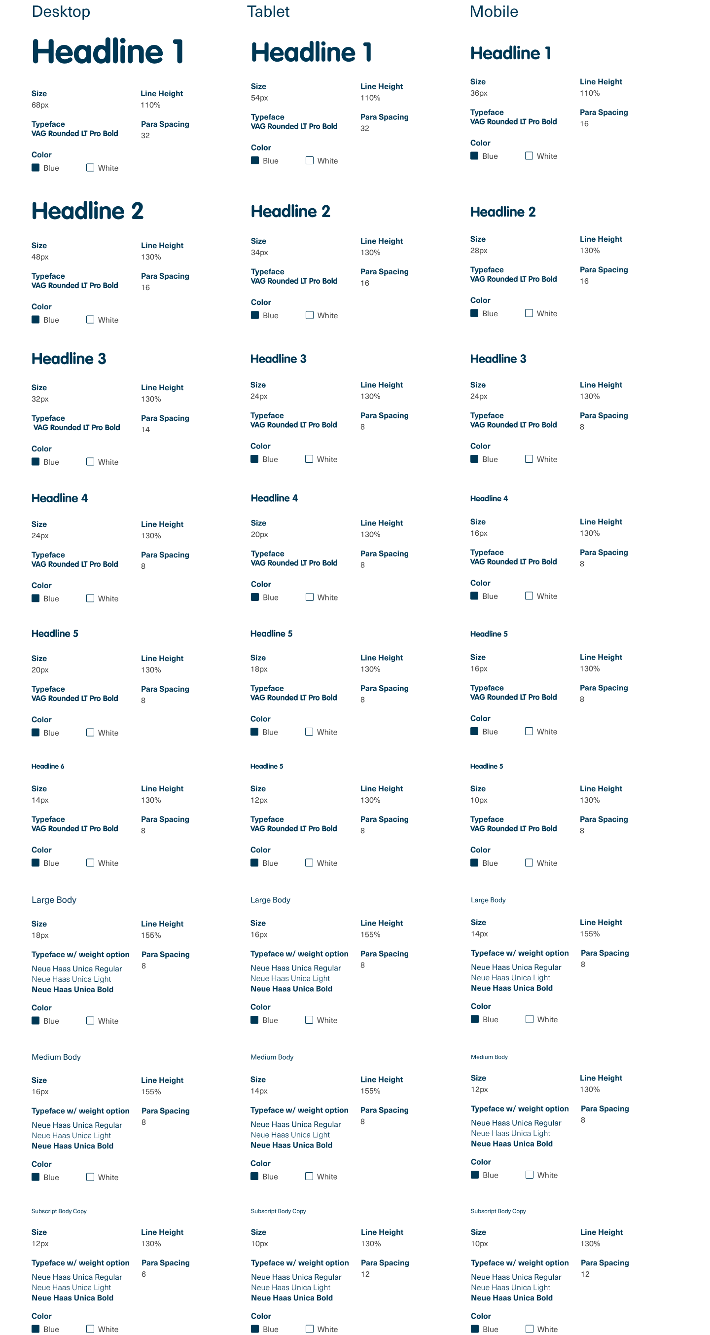
The Lamb Weston font system utilizes VAG Rounded for headlines and sub-headings, and Swiss 721 for body copy.
Typography
LW Design System Core element
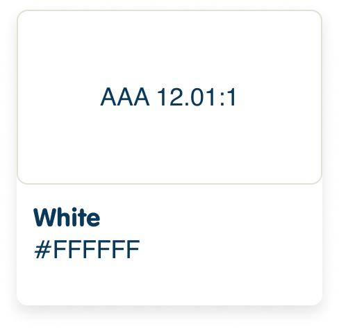
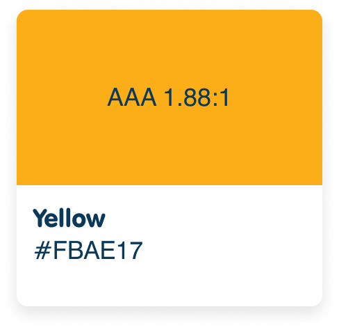
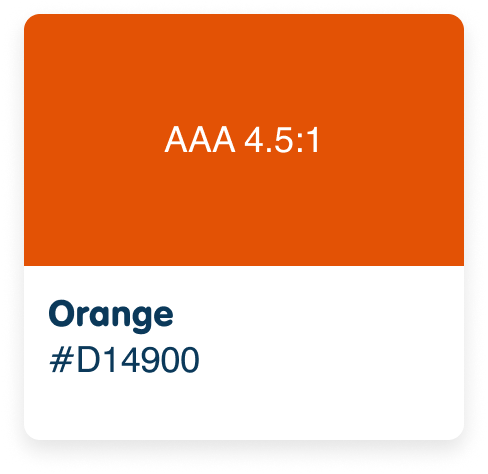
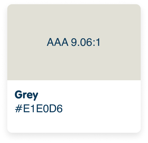
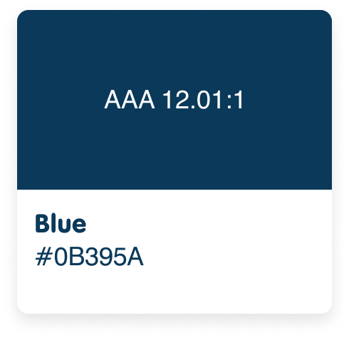
Our palette consists of five colors –blue, gray, orange, yellow and white. Blue and gray should be used most prominently in designs, with orange and yellow used in smaller amounts. Do not use tints of the primary palette colors.
Primary Color Palette
LW Design System Core element
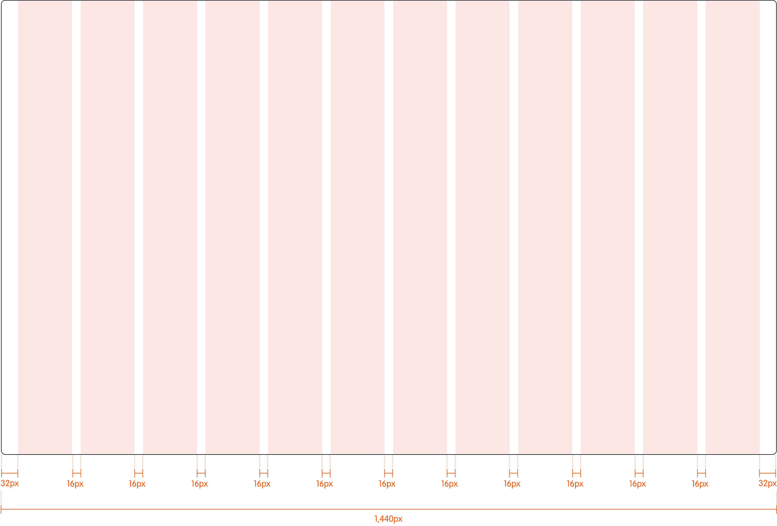
Layout grids define structure, hierarchy, and rhythm in your design. Working from a defined layout system allows you to work faster and more consistently, removing guesswork as you lay out responsive designs.
Grids & Spacing
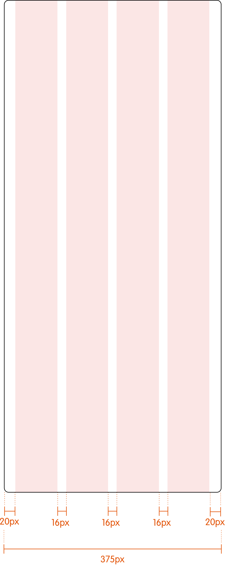
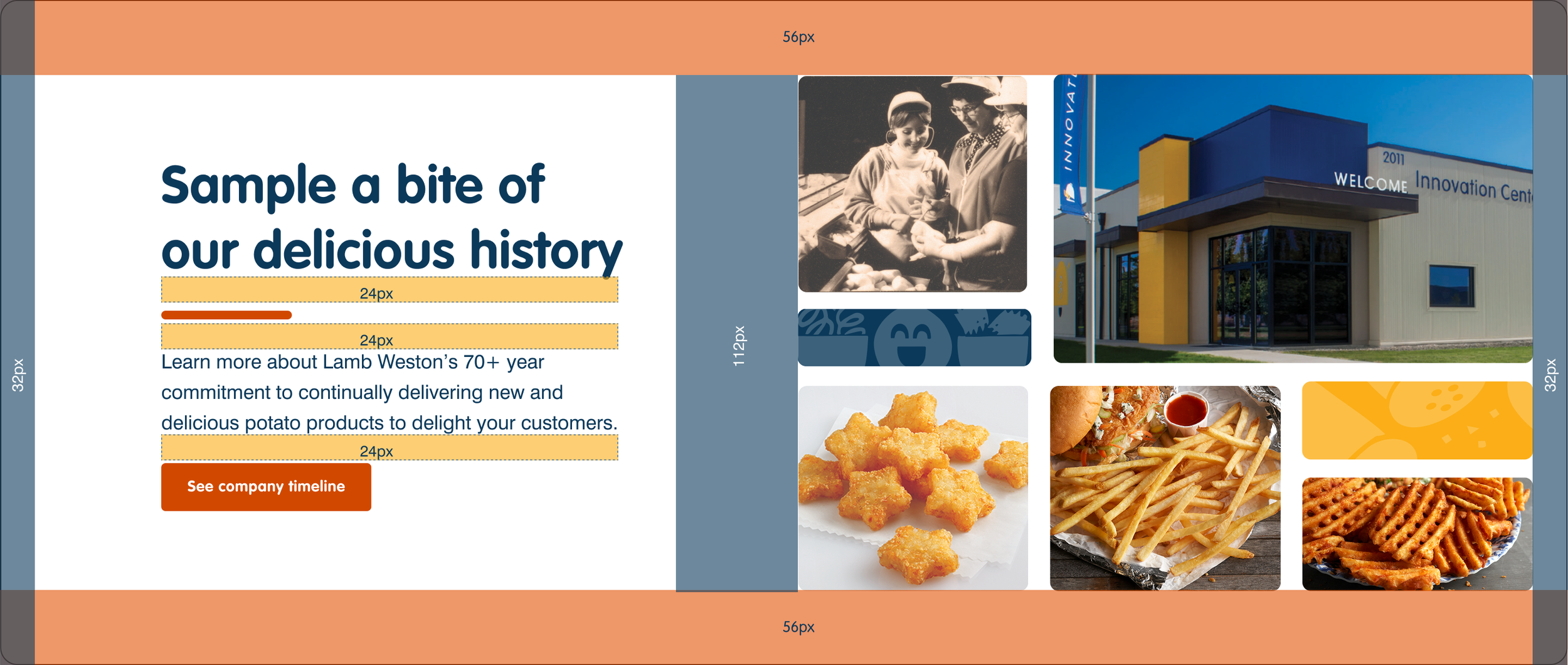
LW Design System Core element
Buttons serve as a means of communicating actions that users can take. In Figma, buttons can be constructed as components using auto layout, ensuring that they scale proportionally across different screens. LW exclusively employs orange as the color for buttons.
buttons


LW Design System Core element
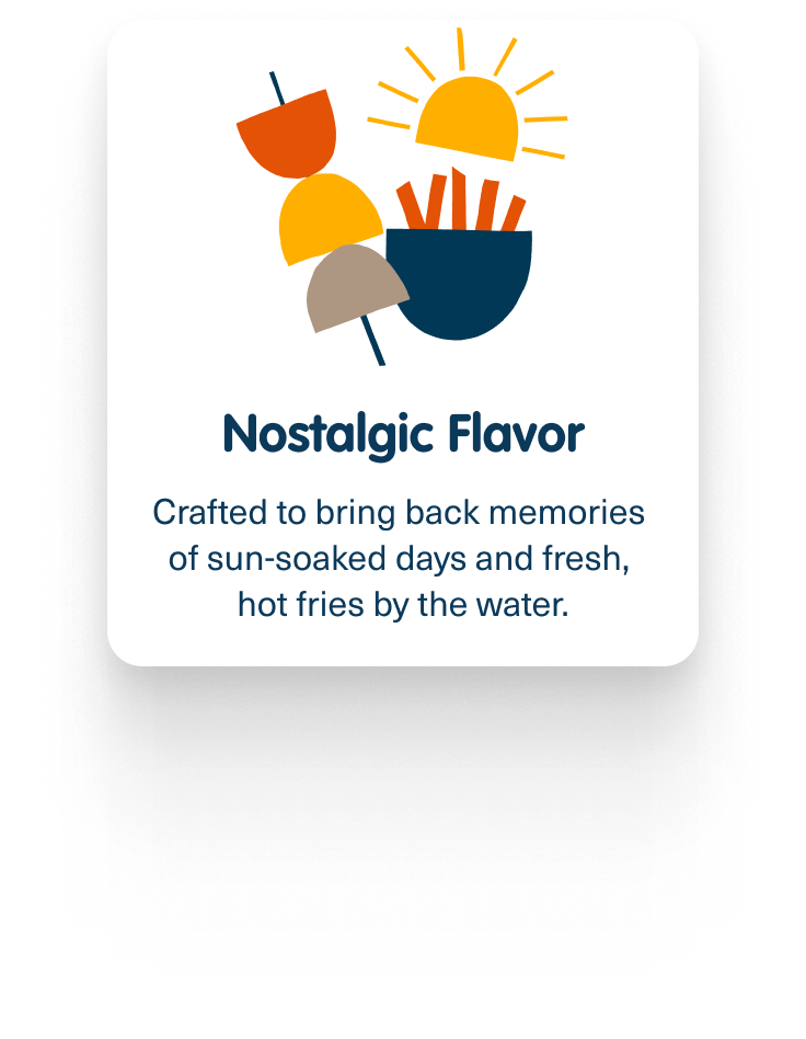
The Lamb Weston Icons are straightforward, blue icons. Social icons, usually found in footers, are in white. For specific products, illustrative icons are used to describe the flavor cues or details about the product.
Icons + Illustrative icons
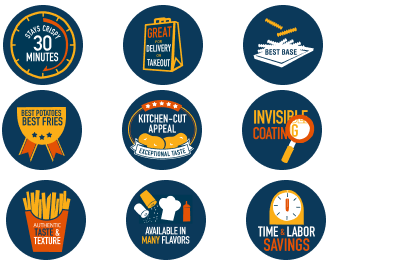

LW Design System Core element
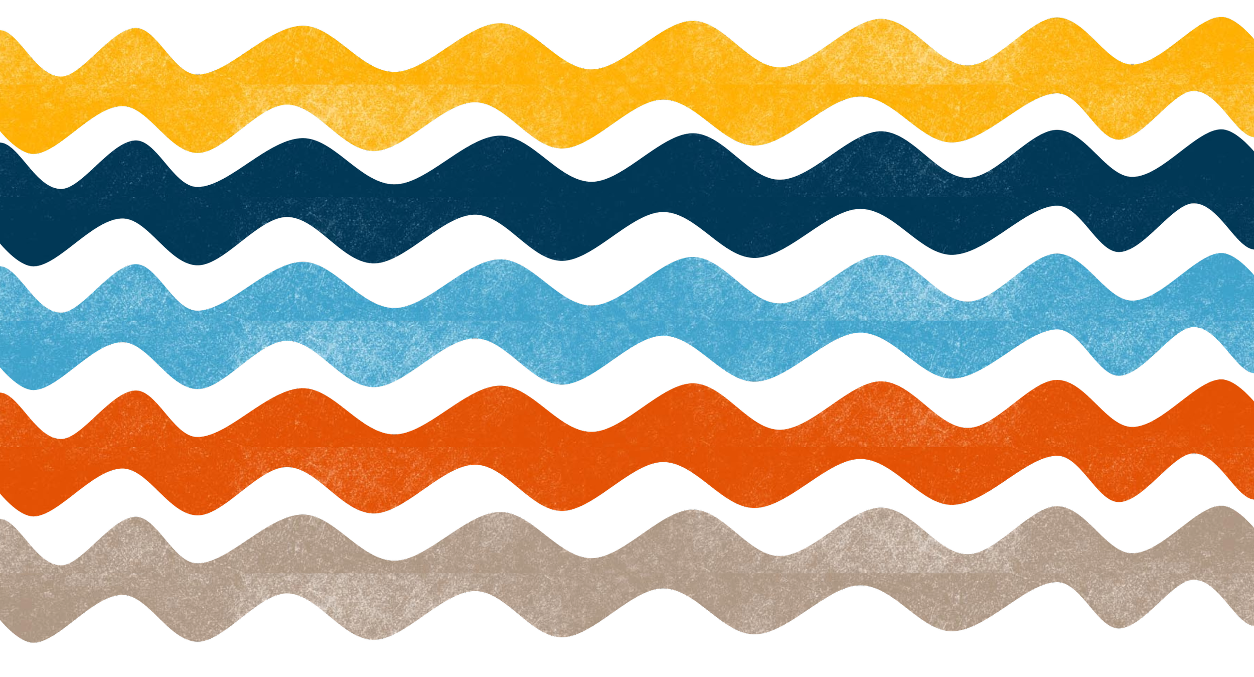
Textures created using a stamping method using potatoes. Colors for the textured pattern use a secondary color pallet and are used for backgrounds
Potato Textures
Components
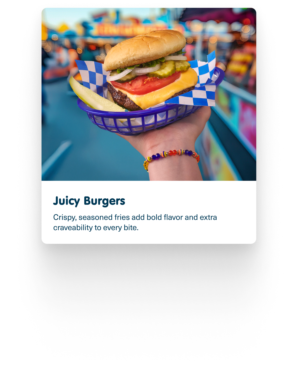
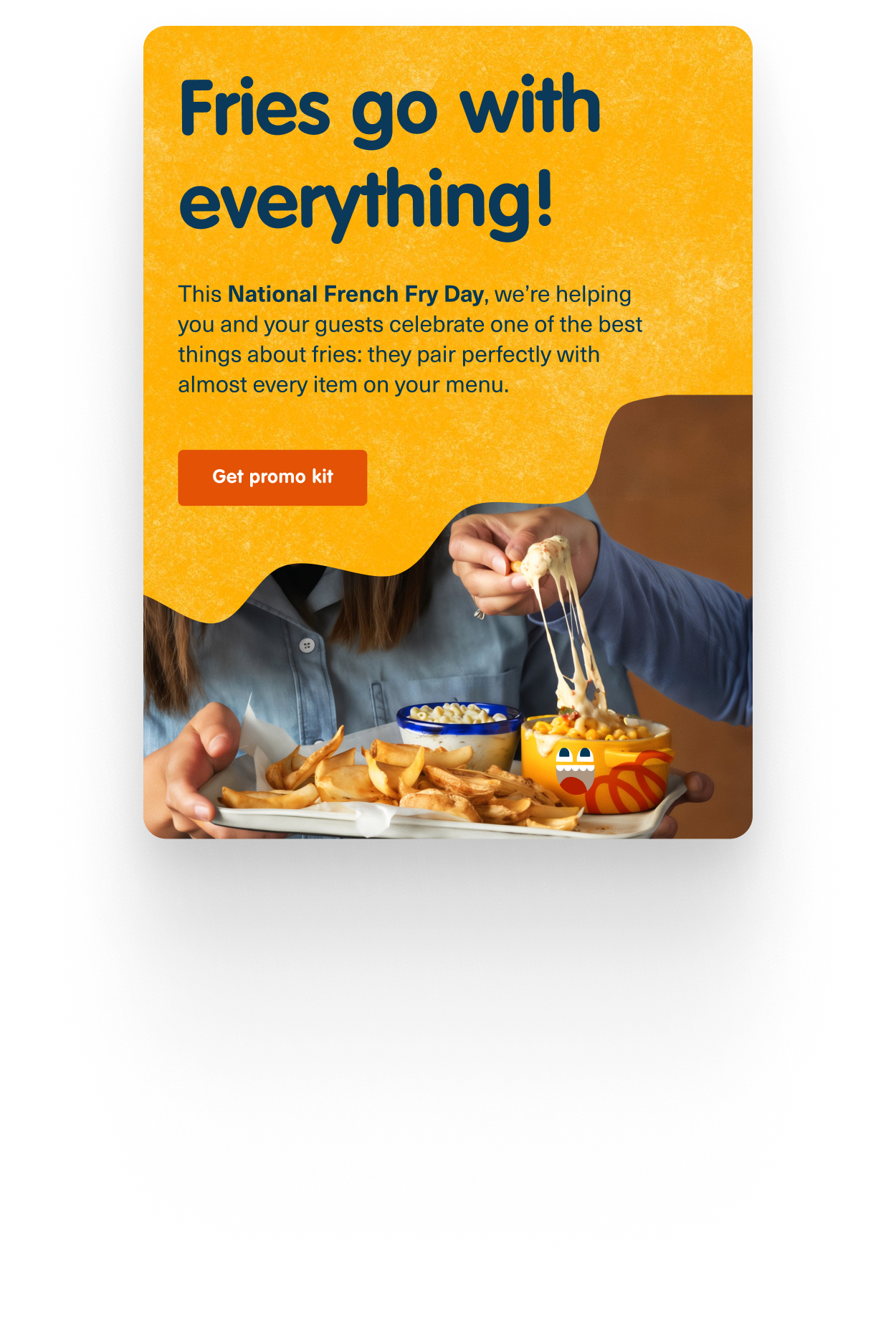
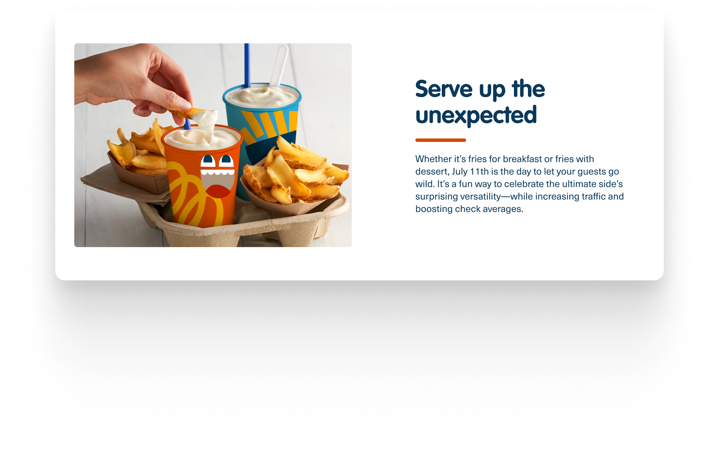
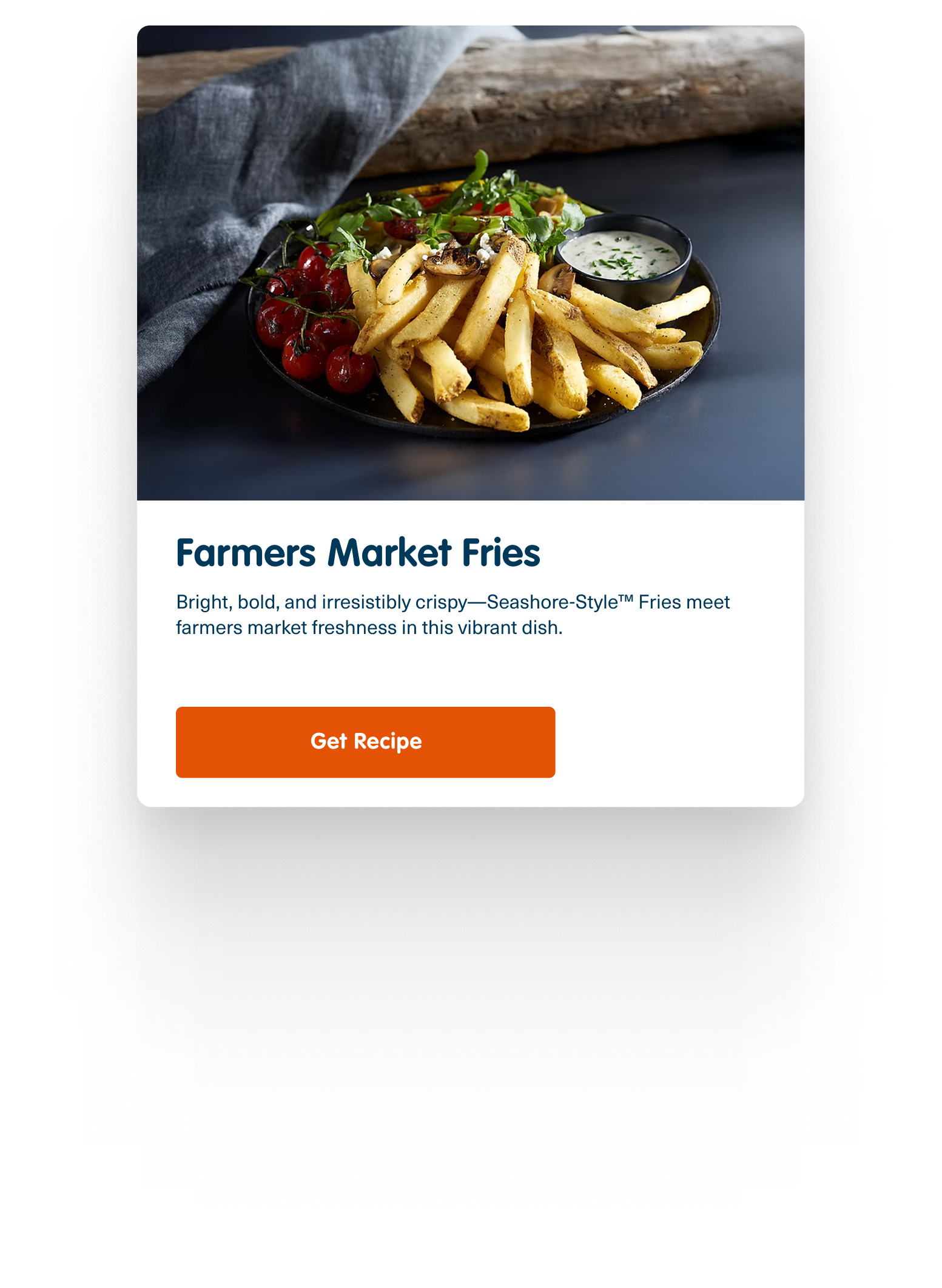
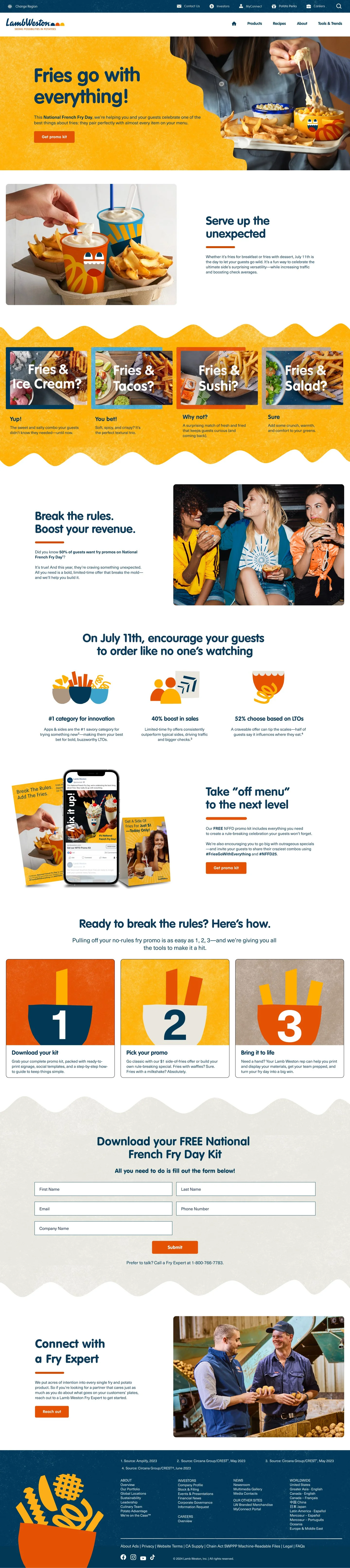
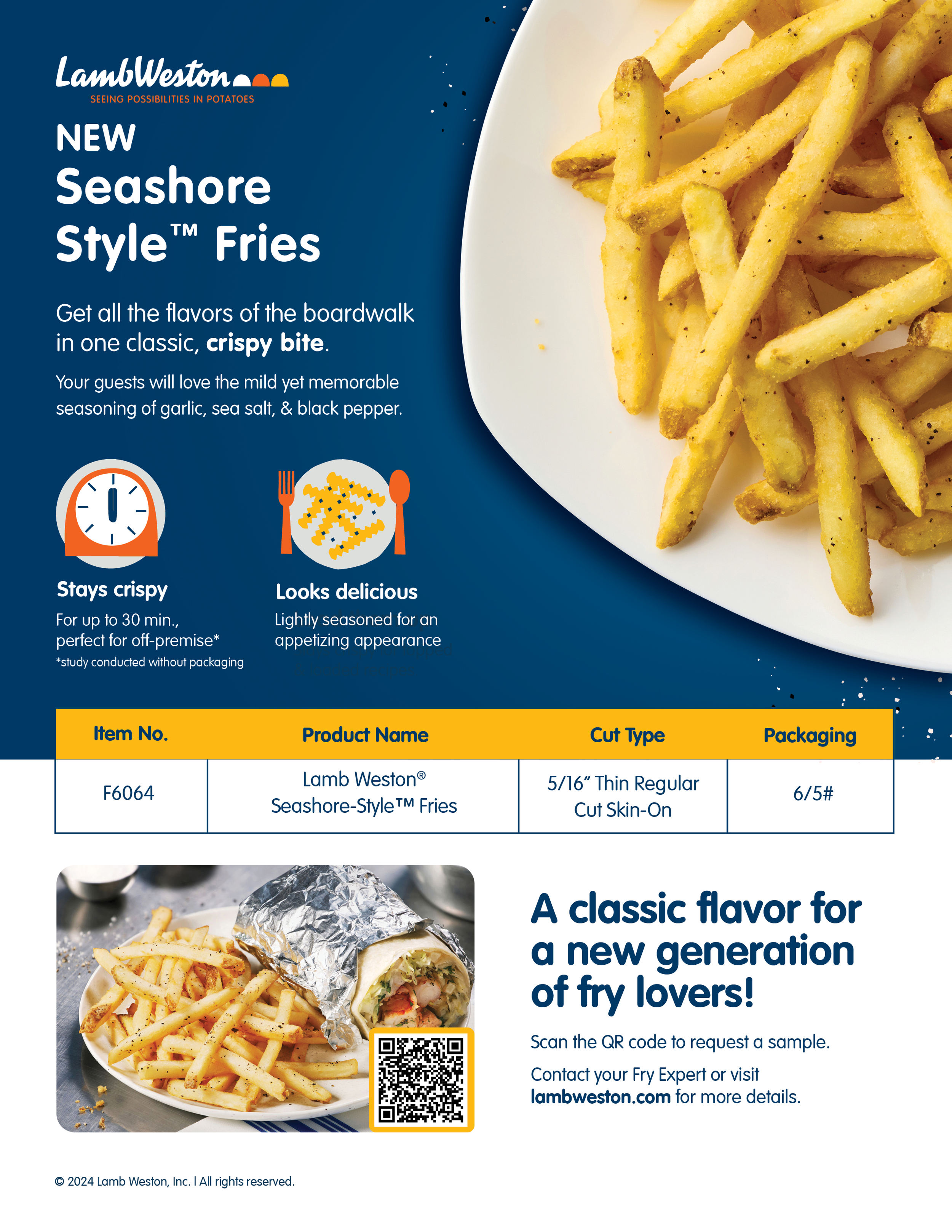
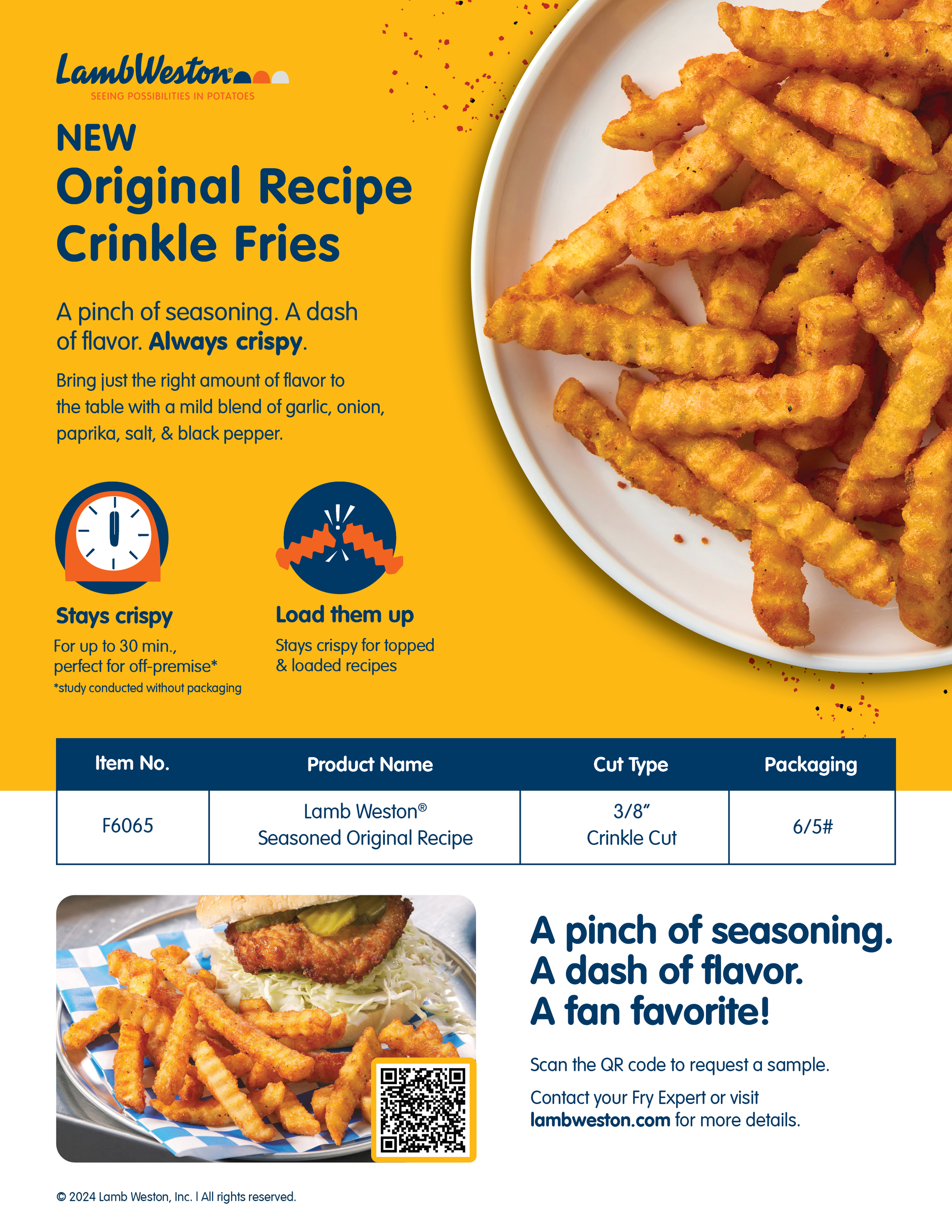
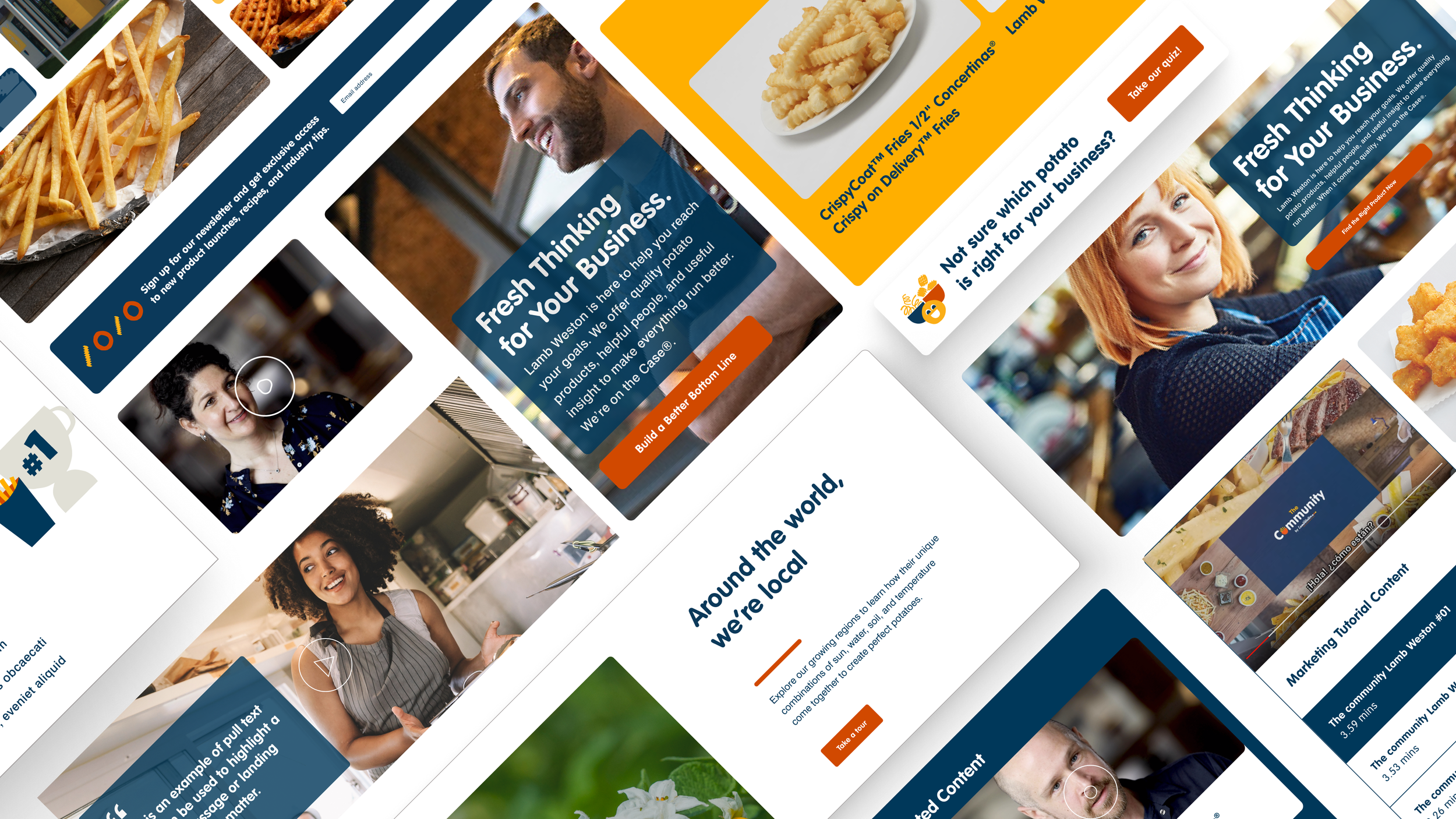
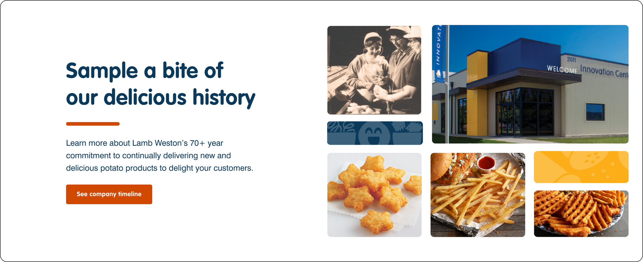
inuse Examples: